Orion App Dock
Product Design | Research
Project Overview
Create a new and intuitive way for advisors to organize and navigate Orion's suite of micro-apps within our flagship software, Orion Connect.
My Contributions
Lead Designer, Researcher
Final deliverable of the various states of the App Dock.
Project Goal
Orion Connect houses every micro-app and third-party integration that Orion develops and supports. For both new and experienced users, this presents a major challenge to organize and quickly jump between the different tools.
On a daily basis, an advisor or representative may need to jump between up to 10 different apps within the platform, but this was incredibly cumbersome and time consuming, requiring a user to reload the dashboard every time they wanted to switch to a new app or having to know the app by name to search it in our search box.
The goal of the App Dock was to remove any friction between switching applications while using Orion Connect, giving direct access to a user's most used apps and allowing each user to customize their menu to suit their specific needs.
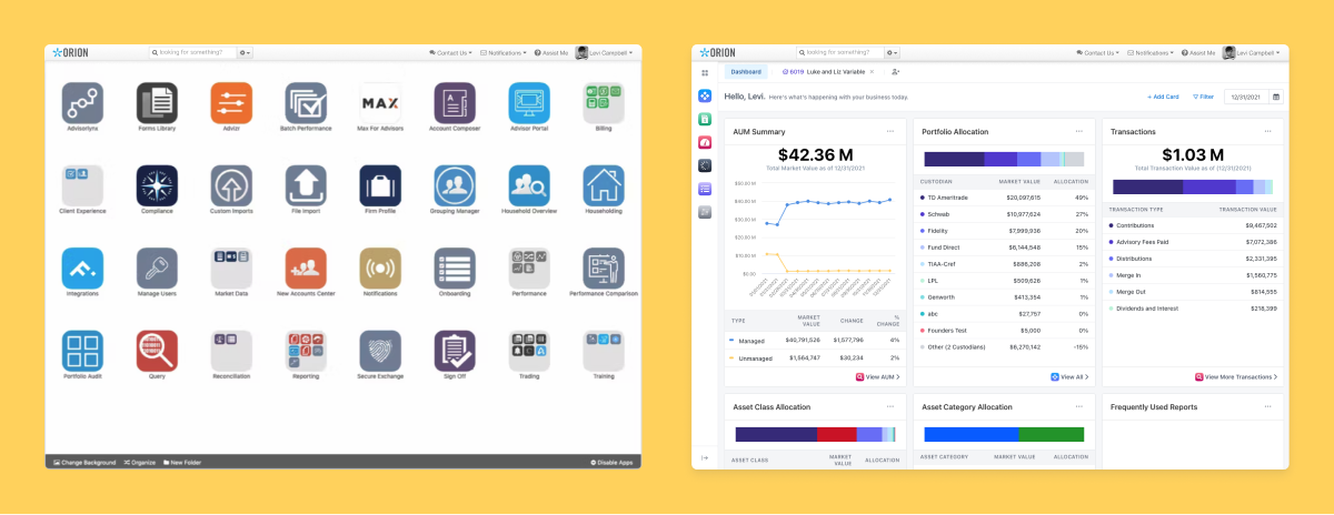
Left shows how users used to access their apps. Right shows the App Dock within the system.
Research
When the new dashboard experience launched, we had a version 1.0 of the App Dock that lived only on the dashboard. Our research really started at that point as we monitored the usage of the new dashboard/app dock and the user's understanding of "favoriting" and rearranging their apps.
We quickly realized it wasn't meeting the goals we had initially set out to achieve, so we started to dig deeper by:
- Speaking directly with 15 firms to understand their needs
- Conducting two autonomous usability studies, surveying 150+ users
- Reviewing usage through analytics and user session viewing
Findings
We found four major issues that we needed to address:
- Platform consistency. Because the current App Dock was only available on the dashboard, it was quickly overlooked and didn't add value once the dashboard had been left. We needed to make it appear globally.
- Sign posting. The customization of the App Dock was one of its biggest strengths, but the lack of sign posting made it hard for users to discover its features. We needed to make it more intuitive.
- Convenience. Getting into specific pages within the app could take multiple clicks or multiple flyout menus. We needed to make it effortless.
- Space. Financial advisors and representatives need a lot of screen space to sift through large amounts of data, but also need the ability switch pages frequently. We needed something flexible for a variety of screens and use cases.
Explorations
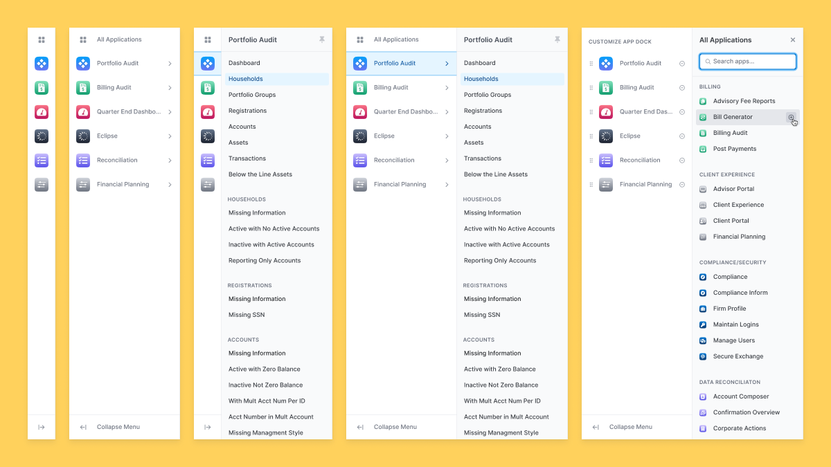
We prototyped and tested a multitude of variations and versions of the App Dock. Collapse and expandable, being able to hide/show the sub menu, flyout menus, slide out menus, slide over functions, you name it.
Whenever we had a polished interaction, we'd share it both internally and externally to gather user feedback, then take it and refine.
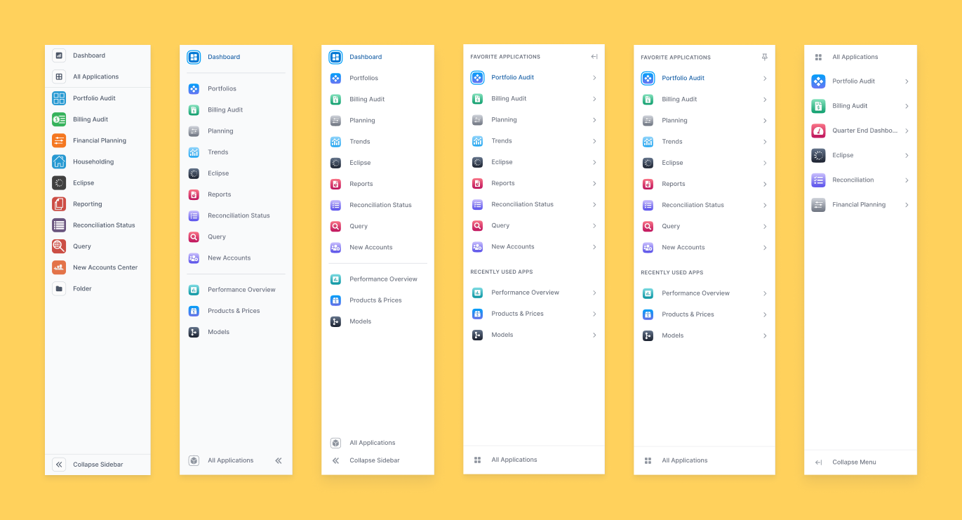
Multiple variations and explorations over time. Some features like Folders and Recently Used Apps didn't make the cut.
Solution
Create an intuitive and customizable navigation experience that can be accessed globally across the Orion Connect platform.
Side by side comparison of being able to jump directly into the page you want.
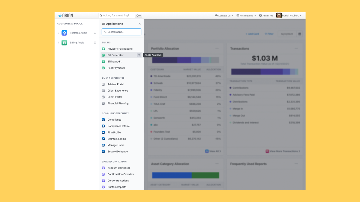
All Applications opens a focused view to allow users to quickly customize their App Dock.
When you open All Applications, you have the ability to search right away or scroll through the list to find the right app. Hovering over the app name reveals the ability to quickly add it to your App Dock.
On the left, you can remove apps or rearrange them at will.
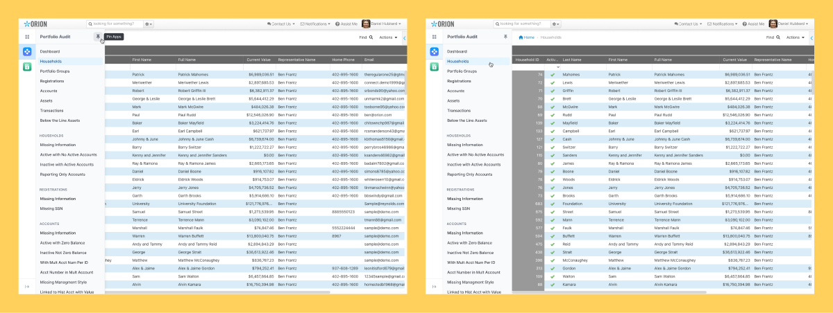
The application's sub menu can be "pinned" so it's always visable.
Within an app, you have the ability to "pin" the sub menu that contains all of the various application pages. Once it's pinned in one app, it stays pinned across every app.
Need more space? Just "unpin" and the sub menu slides away. Hovering over the app reveals the menu when needed.
Outcome
Development of this feature is just coming to a close and is slated to launch on the platform in July.
I've been working hand-in-hand with our engineers, product, QA, service, marketing and sales to ensure not only that the feature looks/feels as designed, but also to align the entire company around this major platform enhancement.
Post-launch we will continue to monitor the performance and usability to make any necessary tweaks. We also have a few other ideas that could be great feature adds in the future such as Folders and a Recently Used app section for apps that haven't been added to the dock.
.gif)
.gif)
.gif)