Orion Product Language
Product Design | Research | Development
Project Overview
Build and maintain a library of components to use across product lines to unify Orion's user experience and brand.
My Contributions
Designer, Researcher, Developer
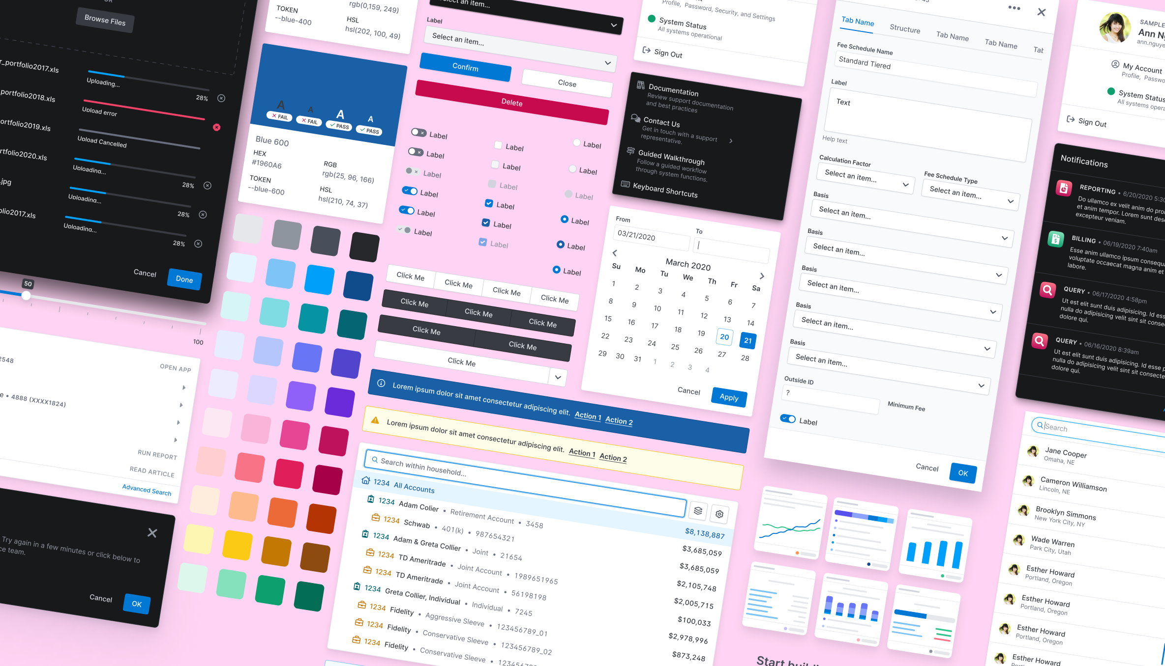
Various examples of OPL components
Project Goal
Orion has been making software for over 20 years, but up until 2017, the design was mainly handled by the engineers building the software. This led to a product that was riddled with consistency issues, lack of accessibility (WCAG 2.1), and desperately needing a modern visual upgrade.
The goal was to unify our design and development teams by providing a consistent language we could speak to one another and a library of components, both in Figma and in code, that could be easily used across our various products.
- 1 to 1 design/dev components
- Single source of truth for designers and developers
- Modern looking/feeling and scalable components
- Dark mode
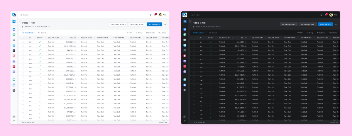
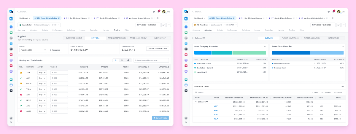
Page templates fully built using OPL components in light and dark mode.
Research
When I joined the team in February 2020, the OPL project was just getting started and we hit the ground running by conducting research into design systems created by top companies around the globe as well as talking with our developers to understand their needs.
We created a UI development group to create buzz around the grassroots project and start to get buy-in from our development teams and leadership. This helped us form a small internal UI Engineering team to start developing the components the design team produced.
The design team crafted guiding principles for our component library that helped us make sound objective decisions for each component.
- Flexible
- Uniform
- Human-Centered
Process
Our system is divided into three main Figma libraries:
- OPL Web - Components
- OPL Core - Typography, Colors, Effects
- OPL Mobile - Mobile Components

By keeping these pieces separate, we've been able to keep each part slimmed down and focused, as well as making it easy for designers to find what they need.
As each component was completed, a designer would write out guidelines for usage and provide examples and showcase any variations a component had. This content was then loaded into our design system site to be consumed by both designer and developer.

Development
Throughout the process I assisted the UX Engineering team in developing each and every component. I was tasked to bridge the gap between the design team and the development teams.
Each component would go through intensive review to assure the look and feel matched the design, down to the pixel. I contributed a significant portion of the front-end styling and all animations. I also helped the team develop our theme switching process and our design token usage.
Dark Mode
From the start, we wanted to create a system that allowed us to offer different themes for our user base. We also had one product that solely used a dark theme and multiple products that solely used a light theme.
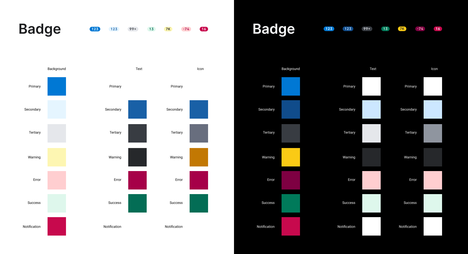
Initially we tried just inverting our colors, but quickly found that each component within the UI needed specific changes between themes. That's where design tokens came in.
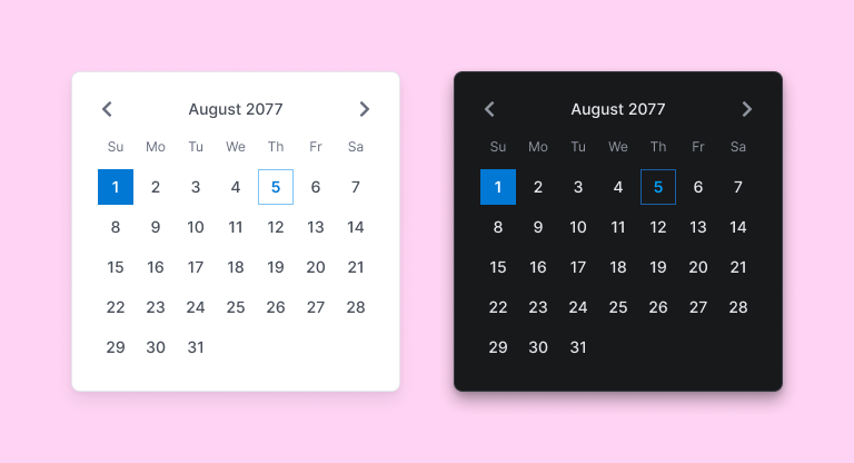
We set off by deconstructing every single component and assigning a specific color token to each individual piece. Background, text, icon, etc, all got their own color. Each of those colors then mapped directly back to our main core colors and allowed us to easily update a single piece of each component if needed.
Leveraging a plugin called Themer, we were able to easily switch color themes within Figma to allow any designer to use dark mode components without having to duplicate our component library.
An example of deconstructing our Badge component into its individual color tokens for light and dark mode.
Office Hours
After launching our 1.0 version of OPL, we started hosting weekly office hour sessions to allow designers and anyone else using OPL to come in and help us make changes to the functionality and design of our components.
This has not only been a great way to keep the system evolving and improving, but it also gives the entire design team and company a say in the direction of OPL. We strive to be ultra collaborative and believe our best work comes from the team working together and office hours has proven that to be the case.
We're always adding new components or finding ways to improve the ones we already have.
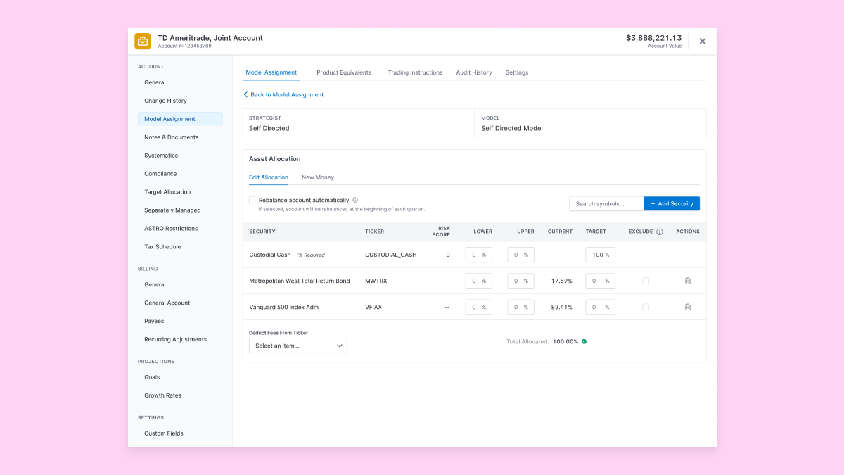
Model assignment page within an account editor all built using OPL components.
Results
From what started as a grassroots project, Orion Product Language is now at the forefront of everything we're doing with product development today.
It is now used by over 50% (and growing) of all the development teams and continues to get updated by the designers and developers in weekly releases.
Here's how OPL has impacted Orion so far:
- The barriers between designer and developer have been broken down and collaboration between teams continues to get better and better.
- New design and development team members can get up to speed way faster thanks to the common components.
- Design and development time has been significantly reduced, allowing for faster output of features and more time to research, test, and iterate.
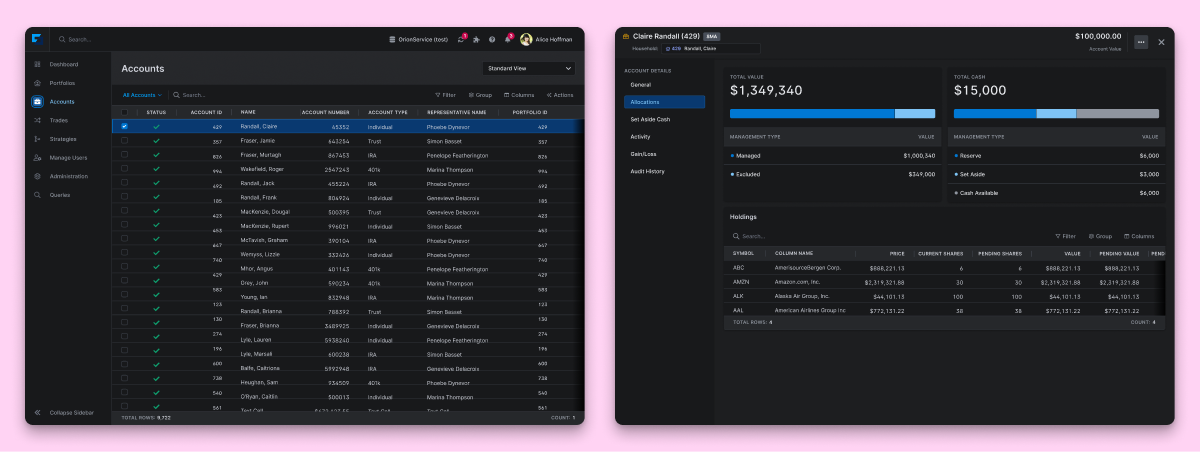
Portfolio view screens built with OPL
With any design system, the work is never truly done. It's as much of a product as any other product in a company. But I'm incredibly proud with what we created and can't wait to see it continue to improve and grow.
Eclipse screens built with OPL